










Dashboard Sprawl Is Killing Your Analytics ROI.
Here’s How to Fix It.
Your organization has invested in Tableau, Power BI, Snowflake, and a full analytics team. And yet someone built a new dashboard last week for a question that three existing dashboards already answer — differently. A VP asked why the numbers in the Q2 board deck didn’t match the numbers on the executive dashboard. Nobody had a good answer.
This is dashboard sprawl. And research confirms what analytics leaders already know firsthand: 43% of dashboard users regularly skip their reports entirely and go back to spreadsheets because they can’t find or trust the existing dashboards. The investment is there. The value isn’t.
What Dashboard Sprawl Actually Is
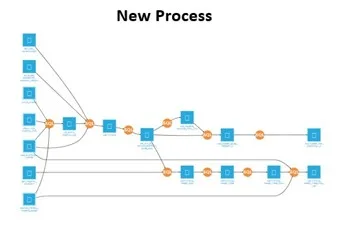
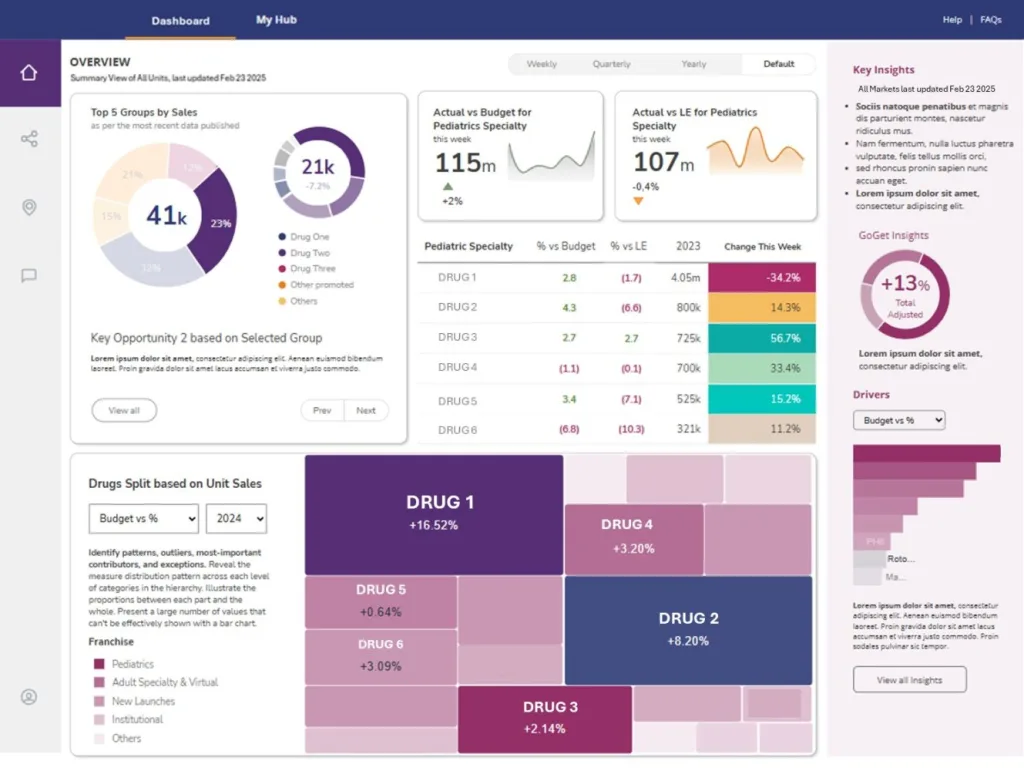
Dashboard sprawl is the uncontrolled proliferation of dashboards, reports, and analytics views across an organization. It’s what happens when teams build new dashboards for every ad hoc request without ever retiring the old ones — and without any governing standard for how metrics are defined, calculated, or owned.
The pattern is completely predictable. A business stakeholder requests a new report. The BI team builds it. Six months later, nobody remembers it exists, so someone requests a similar one. The new one calculates “revenue” slightly differently than the old one. The old one is never deprecated. Now you have two dashboards, two definitions, and a finance team that’s been quietly maintaining a third version in Excel since 2023.
Multiply that pattern across every team, every quarter, and every analyst who’s ever worked at your organization, and you end up with hundreds of overlapping reports that nobody trusts, nobody owns, and nobody can retire because they’re afraid something critical might break.
The Four Signs Your Organization Has a Sprawl Problem
1. Meetings start with “which number are we using?” If your leadership meetings regularly begin with fifteen minutes of reconciling conflicting data points from different dashboards, sprawl is the root cause. The dashboards aren’t wrong — they’re just calculating the same metric differently, and nobody knows which one is authoritative.
2. Your BI team’s backlog is full of requests for reports that already exist. When business users don’t trust or can’t find existing dashboards, they request new ones. Your team builds them. The problem compounds. Research shows that 36% of users say it takes too long to find the right insights in existing dashboards — so they stop trying and request a new one instead.
3. You can’t answer “how many dashboards do we have?” If this question produces uncertainty, you have sprawl. A governed analytics environment has a content inventory. An ungoverned one has a pile.
4. Nobody owns the dashboards that matter most. When the person who built a critical dashboard leaves the organization, who maintains it? If the answer is “whoever notices it’s broken,” you’re one departure away from a business-critical reporting failure.
What’s Actually Causing It
Dashboard sprawl has three structural causes, and none of them are fixable by buying a better BI tool.
No retirement process. Organizations invest heavily in building dashboards and almost nothing in deprecating them. Old dashboards accumulate because nobody owns the decision to remove them. Without an explicit retirement workflow — identify low-usage content, review with stakeholders, archive before deletion — dashboards multiply indefinitely.
No metric governance. When different teams define “revenue,” “active user,” or “conversion” differently, every dashboard built on those terms will show different numbers. The problem isn’t the dashboard — it’s the absence of a semantic layer that defines what each metric means, how it’s calculated, and which source system is authoritative.
The help desk model. When analytics teams respond to every request by building something new rather than pointing to what already exists or improving what doesn’t work, they’re producing outputs, not products. Every one-off build is a future maintenance burden and a future source of conflicting data.
The Fix: Consolidation, Not Addition
The instinct when dashboards aren’t working is to build better ones. That instinct is exactly what created the sprawl in the first place. The fix isn’t addition — it’s consolidation around a single source of truth.
Organizations that successfully eliminate dashboard sprawl do three things:
They build a content inventory first. Before anything else, they catalog what exists — which dashboards, which metrics, which data sources, who built them, when they were last accessed, who uses them. This inventory is the foundation for every governance decision that follows.
They centralize the data model. The most durable fix for conflicting metrics is a semantic layer that defines each metric once — in the data warehouse, in dbt, or in the BI platform’s semantic model — and surfaces it consistently everywhere. When “revenue” has one definition that feeds every dashboard, the dashboards can’t conflict.
They assign owners, not just builders. Every dashboard that matters needs an owner — someone accountable for its accuracy, its performance, and its retirement when it’s no longer needed. Without ownership, governance is aspirational rather than operational.
The real measure of success isn’t how many dashboards you have. It’s how many decisions your dashboards are driving. We’ve seen organizations cut their dashboard count by 60% and double their analytics satisfaction scores — because business users finally had a small number of trusted, well-maintained views instead of hundreds of conflicting options.
What This Looks Like in Practice
One of our clients — a restaurant franchise brand — came to us with 200+ Tableau dashboards across their analytics environment. Fewer than 30 were actively used. The rest were either duplicates, outdated, or built for a business question that no longer existed.
We didn’t build new dashboards. We did an inventory, identified the 12 high-value views their commercial team actually needed, rebuilt them on a centralized data model with consistent metric definitions, and deprecated everything else. Maintenance burden dropped by 80%. The QBR process that previously took two days of manual data assembly became a real-time dashboard that refreshed automatically every morning.
The data team stopped being a help desk. The business started trusting the numbers.
Where to Start
If dashboard sprawl is the problem, the starting point is always the same: a content audit. Two weeks of cataloging what exists, who uses it, when it was last accessed, and which metrics it calculates. That inventory tells you what to keep, what to consolidate, and what to retire — and it gives you the data to make those decisions without guesswork.
If you want help running the audit or building the governance layer that prevents sprawl from returning, that’s what we do.
Request a Conversation →